Storage location
The RA, DEC, seismic and time graphs are stored in directories
RA_graphs,
DEC_graphs,
Seismic_graphs, and
Time_graphs, which are automatically created. MountMonitor outputs the graphs automatically each time the window width is filled with new data. When the program closes, the mount slews or the mount parks the last graphs are stored as well (this depends on the settings in the
preferences) with a grey overlay to indicate the overlap between these last graphs and the previous ones. Once the
Fast Fourier Transformation (FFT) window is openened the FFT graphs are stored at the same pace in directory
FFT_graphs.
RA and DEC graphs
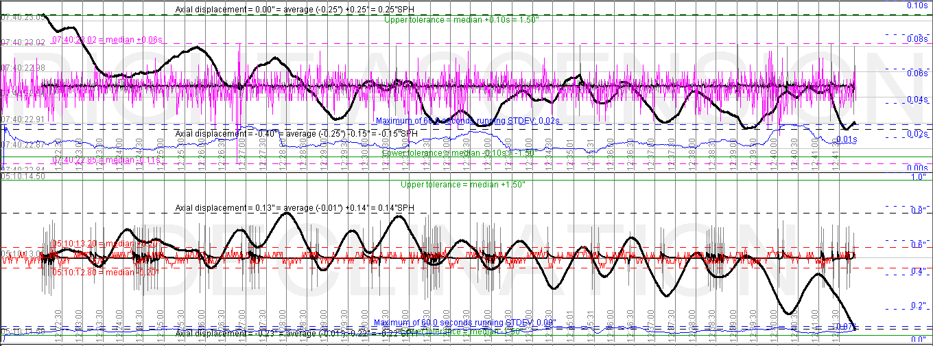
RA is drawn in magenta, DEC in red. In the background the words “RIGHT ASCENSION” and “DECLINATION” are written in light grey. The vertical scale is automatic. The behaviour for RA and DEC depends on the setting made in the Vertical zoom menu (see below). At the left hand side the scale values for the RA and DEC values are shown in grey.
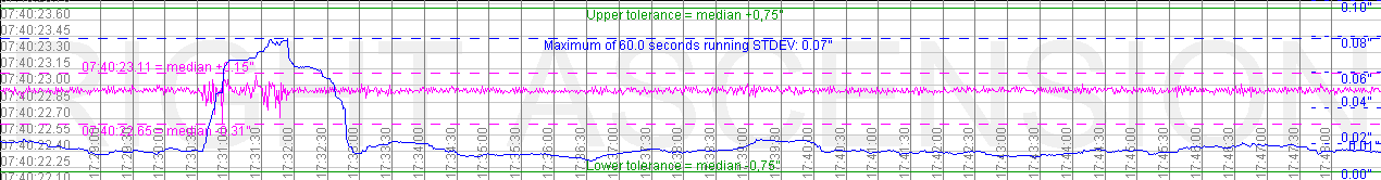
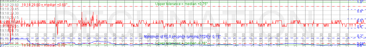
The other lines in the graphs have the following function or meaning:
- The dashed horizontal lines in the same colour as the data show the maximum and minimum values found for that data, including their deviation from median in arc seconds.
- The blue solid undulating line is the running standard deviation, the length of which can be set in the preferences and is annotated at the dashed blue lines.
- The horizontal blue dashed line is the maximum found since recording started. Its corresponding scale is at the right hand side in blue. It has short horizontal blue dashed lines, this to avoid too many lines drawn in the graph. At the centre of this line the length of the running averaga is annotated together with the extreme found value.
- Green horizontal solid lines are the tolerances around the median of the current data, their value can be set in the preferences and are annotated at the centre of the line.
- The grey vertical lines are time fixes, drawn every 30 seconds and annotated with the mount time.
The max and min value lines can be reset in the Reset menu by choosing either Min/Max or Buffers and Min/Max.
Axial speed and displacement graphs
Since version 3.30 the :GaXa#/:GaXb# have been implemented that return the axial orientation of the RA and DEC axis. From this data the axial speeds and axial desplacements can be calculated. Without polar alignment error and refraction, the axial speeds should be 15.02"/s for RA and 0"/s for DEC.
Axial speed
When enabled this data is plotted in the RA and DEC graphs in three different ways:
- As raw speeds (shown in gray): the speed is calculated from two consequetive samples only. This method of course introduces a lot of noise that results from timing delays between the submitted request and received answer. The scale is automatic, but not annotated.
- As a 6 sample running average (shown as a fat black line): the raw speeds are averaged over five samples to produce a less noisy graph. The graph is drawn at the same scale as the raw data and again not annotated.
- As a linear regression (shown as an extra fat black line): using the Running Average Length setting from the preferences menu a linear regression is calculated over a longer period of time, producing a much smoother graph. The disadvantage of this method is that it may smoothen-out small deviations and that it delays the graph by the length of the Running Average Length (but the graphs can be shifted). It is for this reason that the axial speed data is presented in three ways. The values of the speeds are annotated along the min/max lines and shown in arc-seconds per second ["/s].
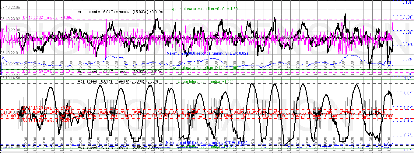 Axial displacement
When this option is chosen the linear regression speed graph is replaced by an axial displacement graph (the raw speed graph and 5-sample running average remain the same). The axial speed data can be integrated to produce an axial displacement graph. Assuming no displacement in the first sample, each speed per time sample is used to calculate the displacement of the axis by integration. The values of the displacement are annotated along the min/max lines and shown in arc-seconds ["] and in spherical arc-seconds ["SPH], which is the arc-second multiplied with the cosine of declination. The latter value can directly be used for comparison with the angular resolution of an imaging device (OTA/camera combination). As with the axial speed the graph is delayed by the length of the Running Average Length.
 Seismic graph
Seismic data is drawn in black. In the background the word “SEISMIC” is written in light grey. The vertical scale is manual and can be set in the preferences menu. At the left hand side the maximum and minumum scale values for the seismic data are shown in grey.
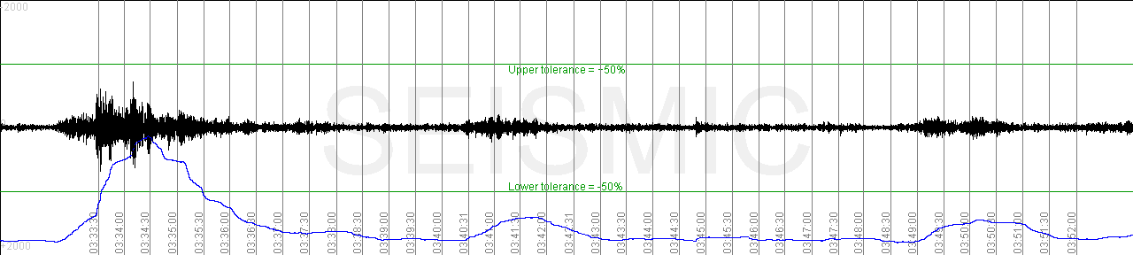
The other lines in the graphs have the following function or meaning:
- The blue solid undulating line is the running standard deviation, the length of which can be set in the preferences.
- Green horizontal solid lines are the tolerances around the median of the current data, their value can be set in the preferences.
- The grey vertical lines are time fixes, drawn every 30 seconds and annotated with the mount time.
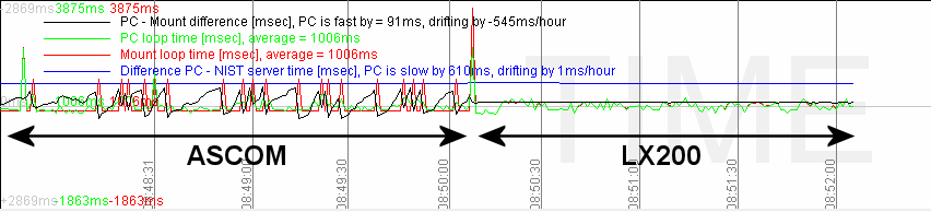
Time graph
Time data is drawn in black, green and red. In the background the word “TIME” is written in light grey. The vertical scale is automatic. At the left hand side the maximum and minumum scale values in milliseconds for the time data are shown in grey. A legend is provided showing the three graph colours, their current values and the drift rate of the black graph.
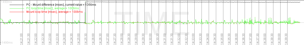
- The black line represents the difference between PC-time and mount-time.
- The green line shows the length of a full loop of MountMonitor according to the PC.
- The red line shows the length of a full loop of MountMonitor according to the mount-clock
- The blue line shows the time difference between PC and the NIST Time Server (only when connected)
When all goes well the red line is almost completely covered by the green line, only showing red dots at the peaks. In order to maintain a large as possible vertical scale the red and green lines have an offset determined by a running average that is equal in length to the running standard deviations of the RA and DEC graps. The value of this running average is annotated in the legend. The black line has no offset, the horizontal grey line in the centre of the graph equals a PC - Mount time-difference of 0 milliseconds.
In case of jumps in the black graph (as in above example, the jump is 1356ms), the red and green graphs will show whether it was the PC-clock or the mount-clock that jumped, although it may be required to open the stored graph in an image processing program to see the details. In above example the PC got synchronised using a NIST Internet Time Server. This causes a jump in delta-time, but has no negative effect on guiding. The leading edge of the black time graph has a green line along it of the same magnitude indicating it was the PC-clock that jumped (I triggered this by synchronising the PC manually).
The other lines in the graphs have the following function or meaning:
- The grey vertical lines are time fixes, drawn every 30 seconds and annotated with the mount time.
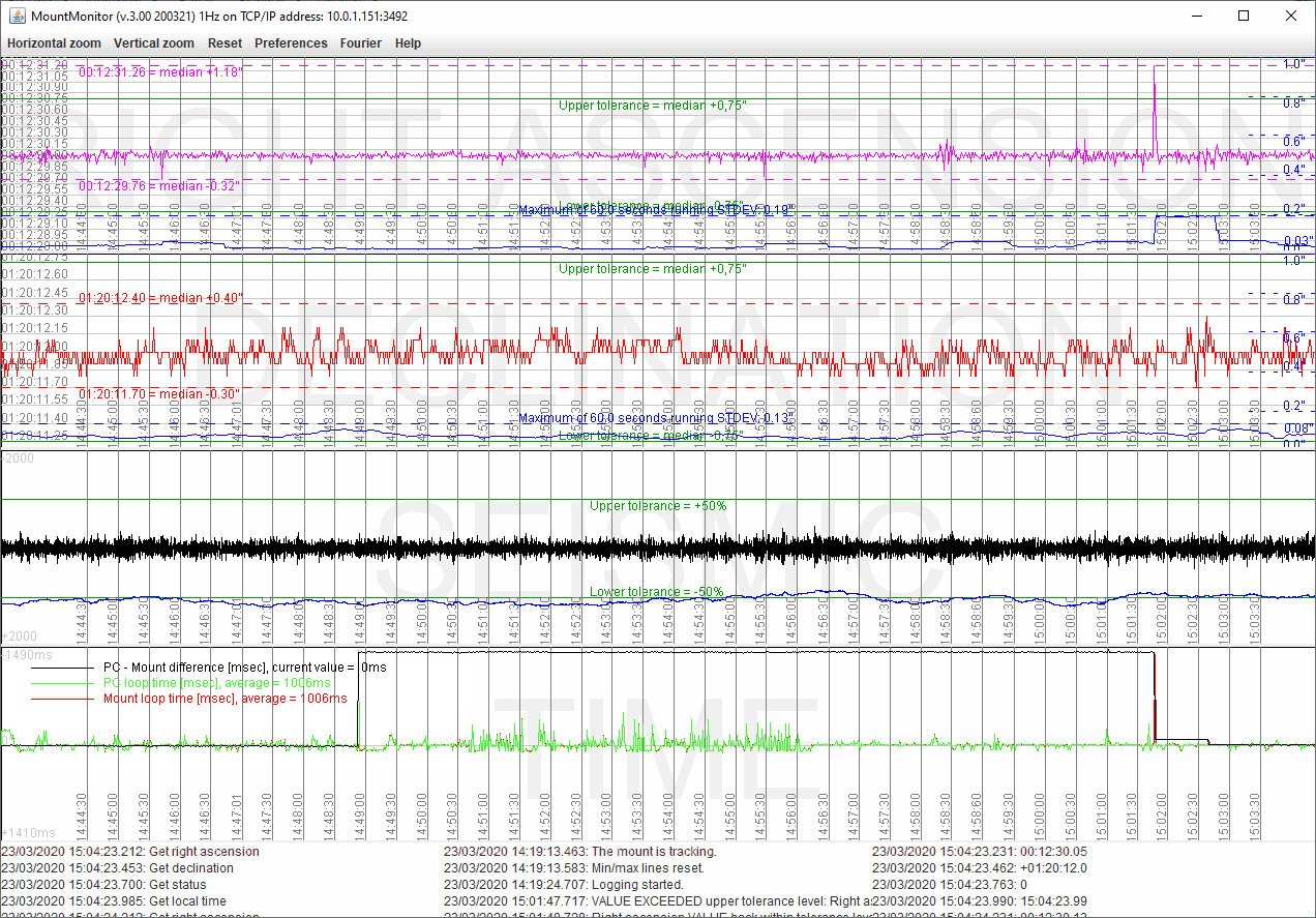
In below image a similar PC-clock-synchronisation induced jump (again with a leading edge of 1356ms), was followed by a second, negative, jump of the same magnitude. In this case the red line along the trailing edge of the delta-time jump indicates that it was caused by the mount clock. This is indeed what happened as I deliberately caused it by allowing the 10Micron time synch utility to synch the mount clock while tracking. The RA-graph at the top shows a jump in right ascension of 1.18 arcseconds as a result of this. The mount quickly corrected for this error and continued tracking at the correct RA-value. In reality this means that the RA-axis jumped, causing a 1.18 arcseconds star trail in the image.
The quality of the time-graph may depend on the connection. The 10Micron GM3000HPS clearly shows a difference in timing accuracy between the LX200-protocol and ASCOM protocol as can be seen in below graph.